Wednesday, January 27, 2010
Typography Self-Portrait
I was pretty excited (and initially a big worried) about this project from my typography class, it's not an uncommon project for design students to be assigned, but I was excited over how well this actually turned out against all of my doubts of being able to pull it off. Amazingly, it actually looks like me as it was suppose to due to assignment requirements. Everything in this portrait is made from the word "Erica" whether big or small, with the exception of a few lone type characters to add emphasis.


Tuesday, January 26, 2010
Photo Edit
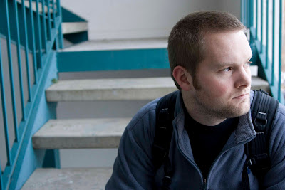
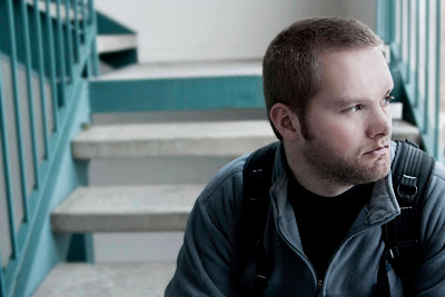
This is my first project for my Photoshop/Digital Imaging class that I've been so excited for this semester. We were required to take a portrait of someone (in this case, my husband) and then do some retouching. Being a portrait, of course, the main focus was editing on the skin to even out skin textures/shadows/etc. I felt the outcome was pretty good for a beginner and am looking forward to doing some more.
Before:

After:

Before:

After:

Thursday, January 21, 2010
A Couple More ...
Sunday, January 17, 2010
Wednesday, January 6, 2010
Corporate Identity/Package Design -- Mandarin Garden
The final project for my Digital Imaging class was to come up with a logo, business card, and package design for a Chinese restaurant without using typical "Chinese restaurant cliches" and the restaurant status was to be similar to that of P.F. Chang's. I really love the logo and was really happy with the overall outcome of the designs all together. I thought the color scheme was fun and sets the restaurant apart from other Chinese restaurants, and the mandarin in the logo gave it a modern, fun, and upbeat feel.

Bag Design

Business card


Bag Design

Business card


Subscribe to:
Comments (Atom)


