Thursday, February 18, 2010

Valentine's 2010

I love any excuse to make "pretty" treats and give to people, and Valentine's Day happens to be one of those excuses. Not only do I love making the treat itself look cute, I especially love packaging, tagging, and adding my own special details to them. (Luckily I work with a whole office full of women who can appreciate this obsession). This year my mom and I chocolate-dipped and pink-sprinkled Oreo cookies, put them in bags, tied them with an appropriate "red lipstick kiss" ribbon and finished it off with a tag I designed. I loved the typography used for the tag, I thought it looked clean and simple yet still created the Valentine day theme using words and colors reminiscent of the holiday .


Tuesday, February 2, 2010

Farewell Announcement


A good friend that I work with asked me if I would design a mission farewell announcement for her son that she could send out to her family and friends. I was really excited to help out with this project because 1. I think Julie is the best and 2. I've never done something like this before. Now, I realize it's not anything extremely different from a baby or graduation announcement, but it was a unique occasion and I was excited to take a shot at it. I think it turned great, I love the colors and the quote that was incorporated into the layout. Thanks Julie for the opportunity and good luck to you Morgan on your mission! (click the image to view full size/legible)


Wednesday, January 27, 2010

Typography Self-Portrait

I was pretty excited (and initially a big worried) about this project from my typography class, it's not an uncommon project for design students to be assigned, but I was excited over how well this actually turned out against all of my doubts of being able to pull it off. Amazingly, it actually looks like me as it was suppose to due to assignment requirements. Everything in this portrait is made from the word "Erica" whether big or small, with the exception of a few lone type characters to add emphasis.

Tuesday, January 26, 2010

Photo Edit

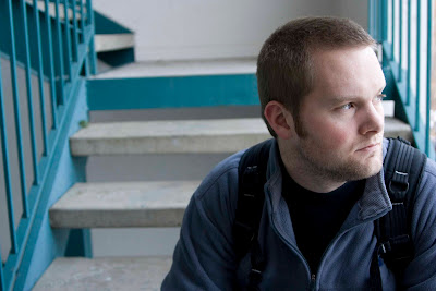
This is my first project for my Photoshop/Digital Imaging class that I've been so excited for this semester. We were required to take a portrait of someone (in this case, my husband) and then do some retouching. Being a portrait, of course, the main focus was editing on the skin to even out skin textures/shadows/etc. I felt the outcome was pretty good for a beginner and am looking forward to doing some more.

Before:


After:


Thursday, January 21, 2010

A Couple More ...

A couple more samples for your viewing pleasure. Keep checking back, there is more coming slowly, but surely! :o)


Sunday, January 17, 2010

Grad Announcements

Check back soon, more samples to come!


Wednesday, January 6, 2010

Corporate Identity/Package Design -- Mandarin Garden

The final project for my Digital Imaging class was to come up with a logo, business card, and package design for a Chinese restaurant without using typical "Chinese restaurant cliches" and the restaurant status was to be similar to that of P.F. Chang's. I really love the logo and was really happy with the overall outcome of the designs all together. I thought the color scheme was fun and sets the restaurant apart from other Chinese restaurants, and the mandarin in the logo gave it a modern, fun, and upbeat feel.


Bag Design


Business card