Tuesday, April 27, 2010

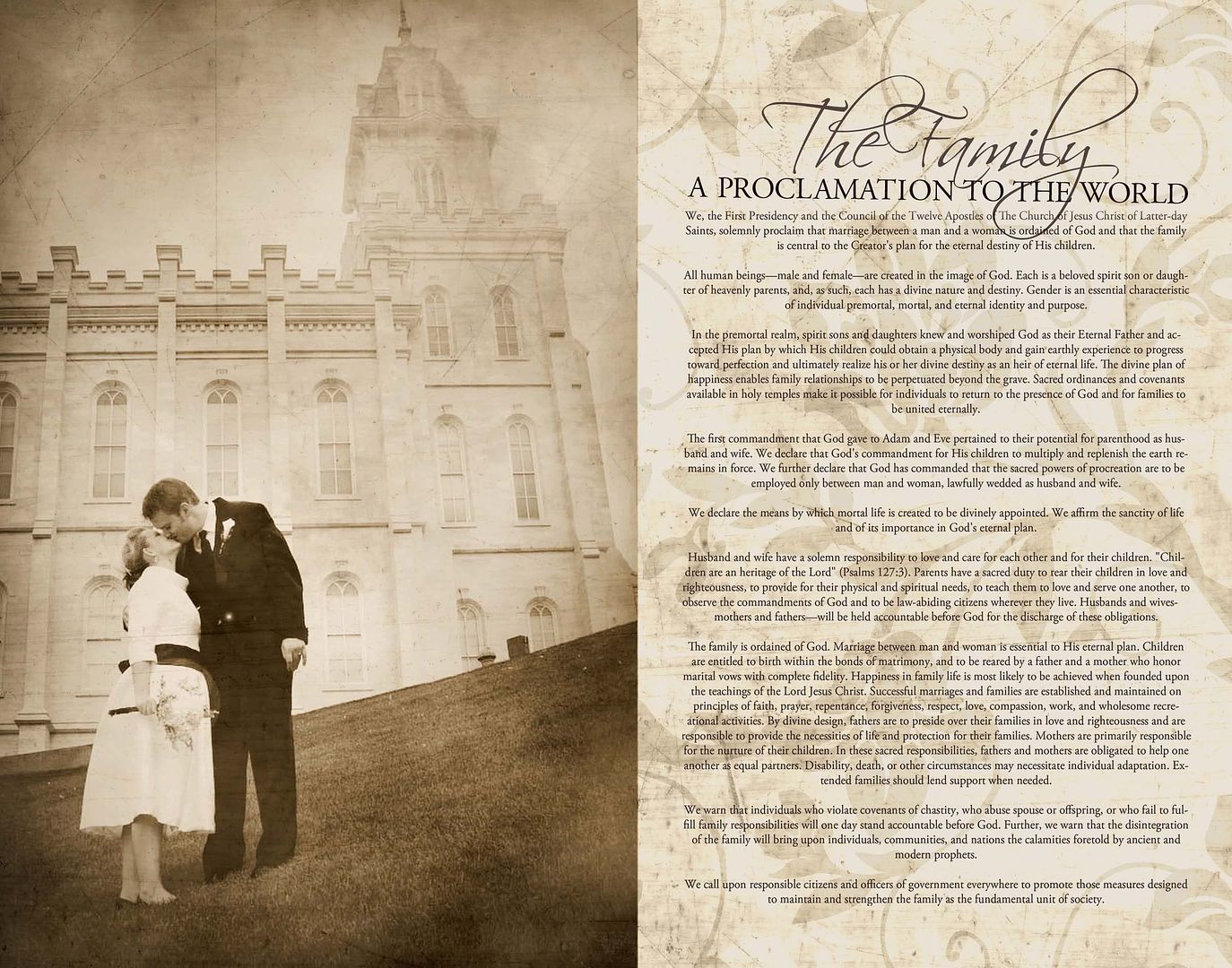
And, one for me...


Like I said, it wouldn't be long before I had one of these for myself. (Although I haven't printed it yet, I did spend some time doing this that I should have been studying for finals....oops). Doesn't this feel so "vintage" though? I love it. I choose to use one of our wedding photos, which I would have liked to have done for Kellie's but since I had to steal the photo from the wedding invite I did for her, I had minimal photo options. I have had a request from my cousin to make one for her using the Provo Temple as the photo since she now has kids and felt like a wedding photo would have to be displayed in her bedroom (that sounds strange, but you know what I mean). I thought that was a great idea. A family photo would also be nice. Lots of options, and I think something like this makes a great gift. Mother's Day is just around the corner!

Friday, April 23, 2010

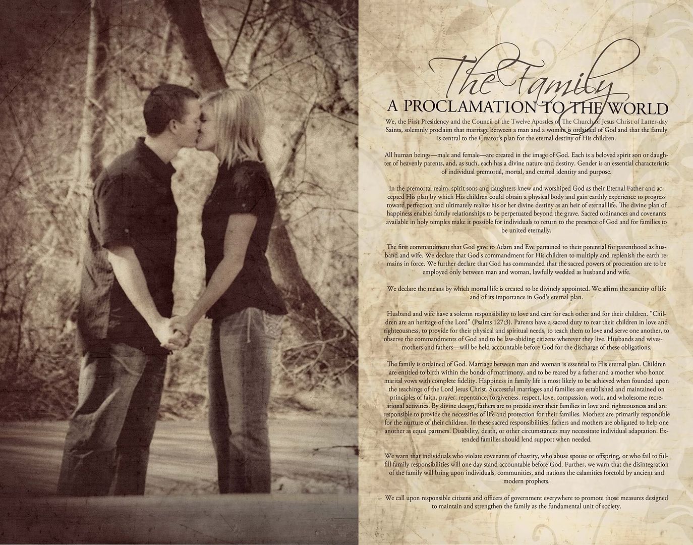
A Wedding Gift


I've been wanting to do something like this for a while now, and love how it turned out. This is a design I created and framed 11x14 as a piece for my friend's wedding gift. (As she is getting married tomorrow I am hoping she's too busy to see this before she opens it.... :0) I like it so much that I don't think it'll be long before I start working on one for myself. If you're interested in having one of YOUR own, or to give as a gift, let me know!

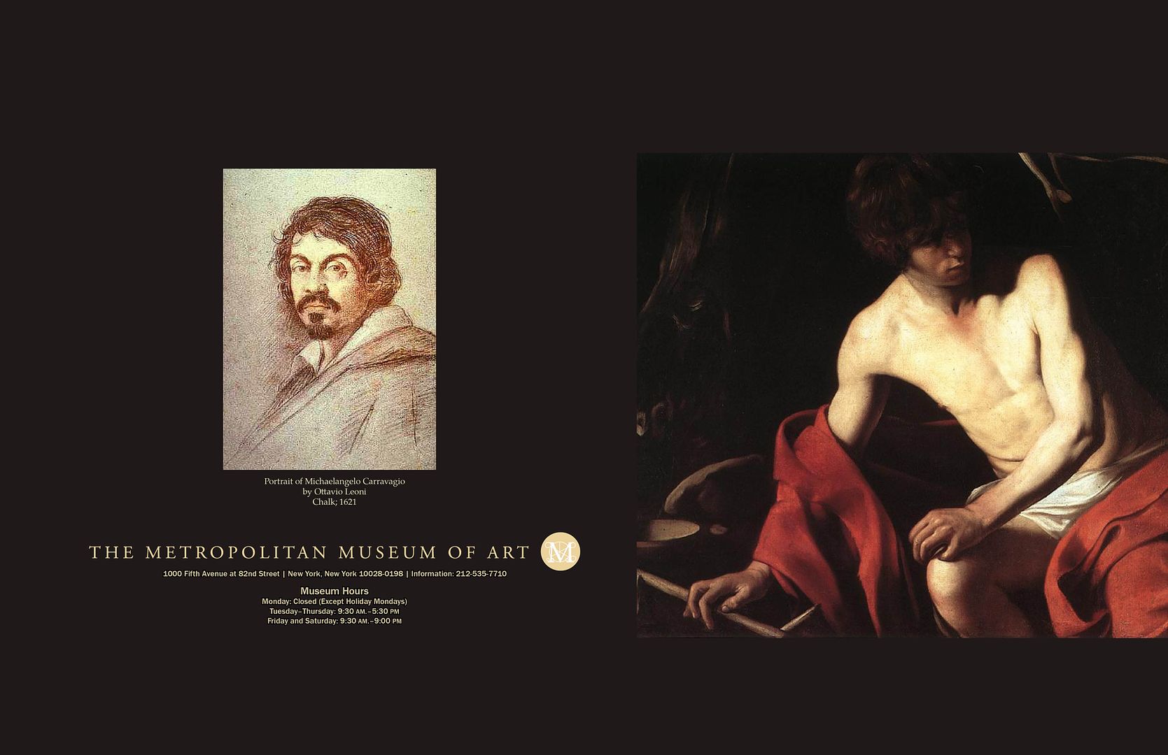
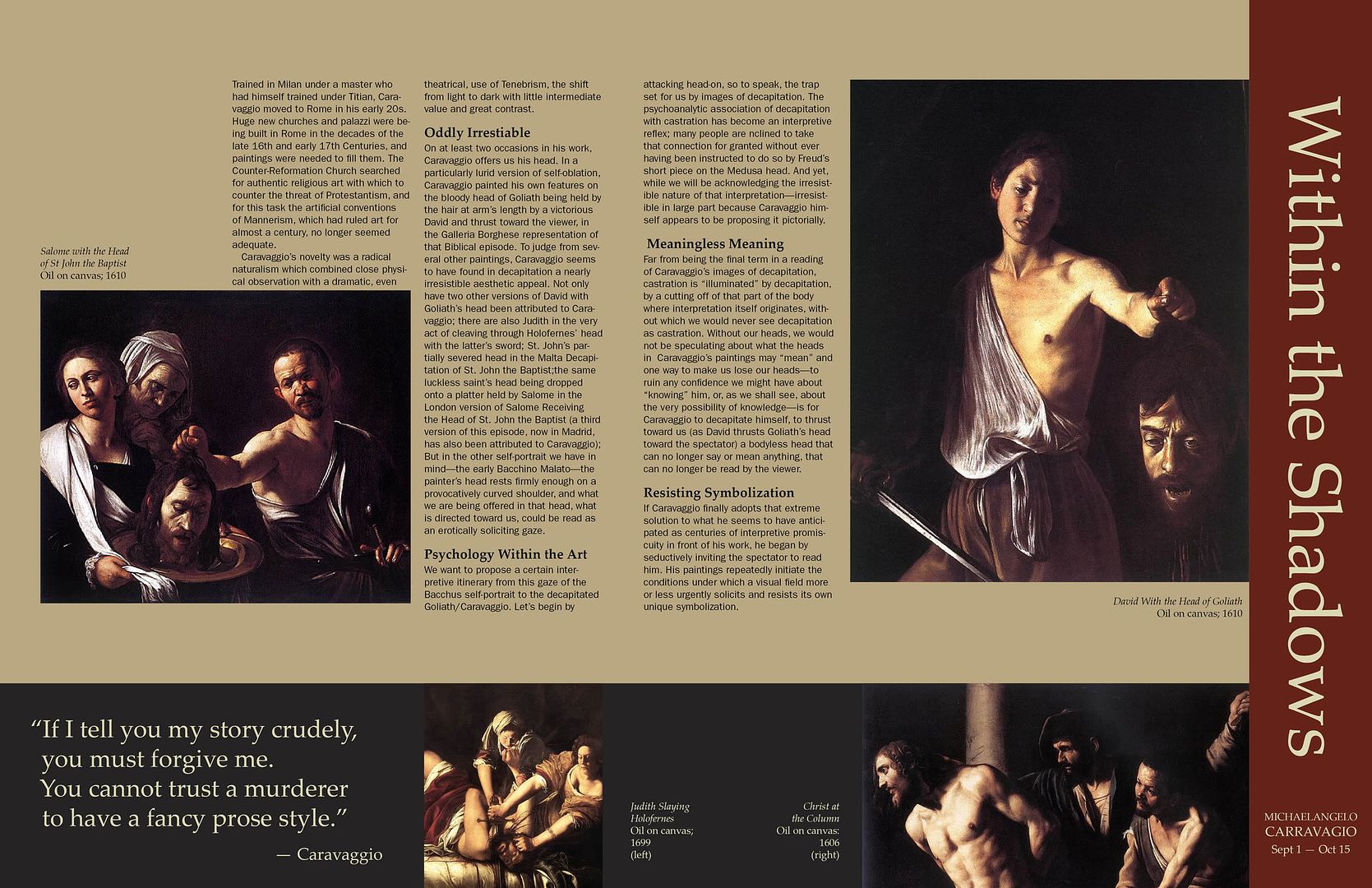
Art Exhibit Brochure


This was my final project in my typography class. Requirements were to design a brochure for a mock art exhibit at the Metropolitan Museum of Art. I chose to do mine on Carravagio because I love the deep, rich colors he used in his art and felt that using the same colors in the brochure would enhance his artwork and allow for an overall clean and simplistic brochure to work. I'm proud to say that my very picky/perfectionist teacher really liked it, which was wonderful because he's a hard one to impress.


Saturday, April 17, 2010

Digital Imaging Final Project

For my Digital Imaging Final Project we were required to create 5 images of our choice that had a theme or commonality within each of them. I love anything old, worn, and antique and that looks as if it'd have a story to tell if it were able to talk. I ventured off to Eureka and shot the images below. I chose to emphasize their "stories" by creating a distressed, old film-like texture on the images and then recreate them in black and white.


Thursday, April 15, 2010

Kellie + Brian Part II : The Print


Here is the printed version of Kellie & Brian's invitation from the previous post. I wanted to post this to show the actual invite design itself rather than just the front and back spreads. (please excuse the poor quality photos. Lighting was an issue with the coated paper)

Thursday, April 8, 2010

Kellie + Brian

Oh my! I've been so excited about this wedding invite, and it's been killing me while waiting to share it! Not only is it beautiful and unique, but it's for my best friend with whom I was pretty much conjoined at the hip with and love like a sister. I was so excited when Kellie asked me to design her invitation, and it was fun to get to be a part of her "special day" in some way. Her colors worked perfectly with the "outdoor-esque" theme she wanted to go for, yet still allowed for a touch of elegance. It may be hard to tell from these files (I will post a photo of the printed and folded invite soon), but I loved the uniqueness of the design, size and layout. She decided on a double sided tri-fold and to add a little pizazz we made the "Brian & Kellie" text hang out further than the front panel when folded. I also really liked that we put their registries on the back panel of the invite. Kellie wanted to incorporate them somehow without being overbearing and I think the back panel was a perfect place to do so.

Congratulations Kellie and Brian, I am so happy for you and wish you the best! Thanks for letting me be a part of your wedding!

Inside spread:
Outside spread:


Wednesday, April 7, 2010

Texture

This semester I have been taking a digital imaging class and am learning so much. I have also rediscovered that I love photos just as much as I love designing and creativity. It doesn't get much better when you can combine all of those together! This is a photo from our recent trip to Moab that I decided to edit for use as a project in my imaging class emphasizing texture. I was excited with the way this one turned out and felt the texture was incredibly fitting for the environment of the photo.