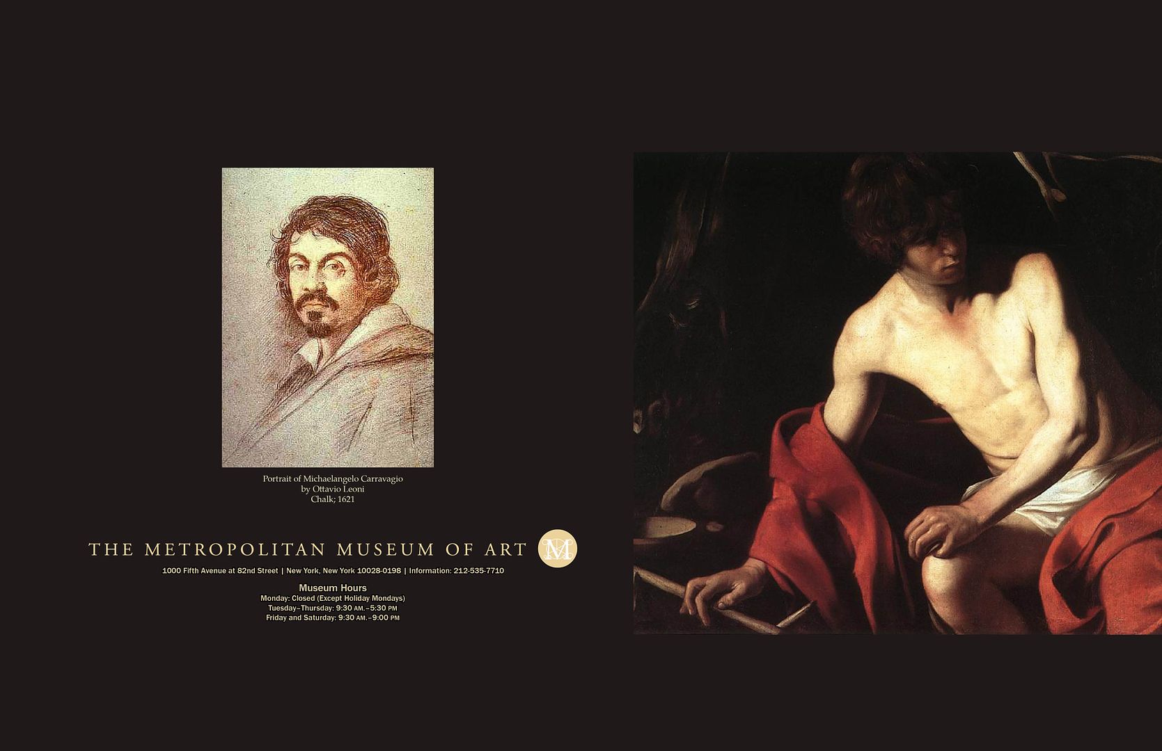
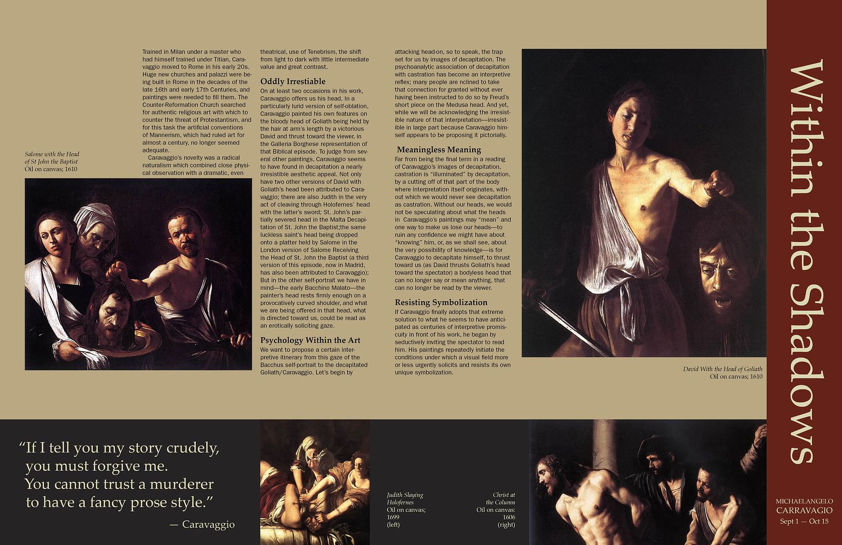
This was my final project in my typography class. Requirements were to design a brochure for a mock art exhibit at the Metropolitan Museum of Art. I chose to do mine on Carravagio because I love the deep, rich colors he used in his art and felt that using the same colors in the brochure would enhance his artwork and allow for an overall clean and simplistic brochure to work. I'm proud to say that my very picky/perfectionist teacher really liked it, which was wonderful because he's a hard one to impress.

No comments:
Post a Comment